Making cold showers a habit, not a hurdle.
The Wim Hof Method is powerful: breathing, cold exposure, mindset. The app was overwhelming. In five weeks our team of three redesigned it so newcomers know where to start, can see their progress, and have friends pulling them into the cold.
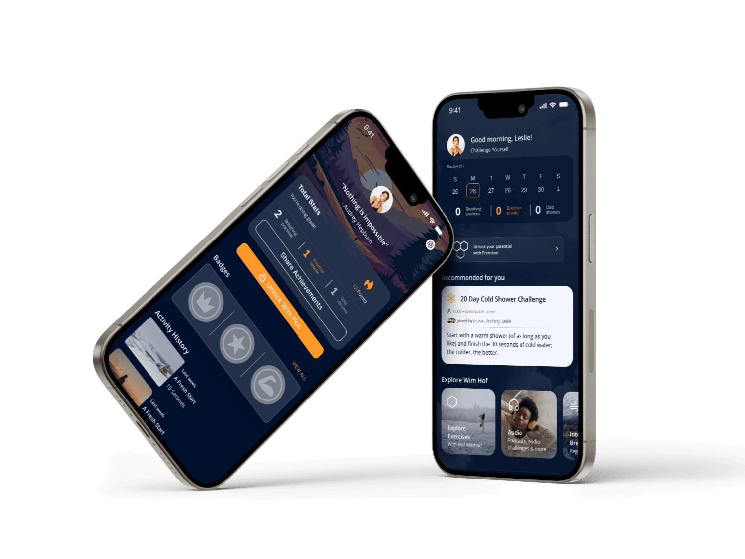
Beginners weren't lacking willpower. They were lacking feedback.
80% of the people we interviewed named progress tracking as their top concern when starting cold exposure. So we made progress the home screen, turned the 20-day challenge into something you do with friends, and made the app finally look cold.
Too many features, not enough first steps.
The app packed breathing exercises, cold exposure and mindset practices into one place, and new users bounced off the complexity. Our audit found four problems:
- The palette said "cozy", not "cold". Warm whites and orange contradicted the whole method.
- Progress was buried. Too many taps to find your own data, which was little more than a basic results graph.
- No community. A practice that's hard alone had no way to do it together.
- Outdated patterns, like pop-up messages, made the experience feel older than the method.
Why the business cares: a wellness app lives on consistent use. If beginners can't get started or can't see themselves improving, they don't come back, and they never reach premium.
Nobody else had built the team around the cold.
of interviewees named progress tracking as their top concern
usability test participants
tasks per session
from audit to tested prototype
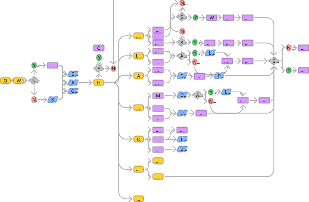
Direct competitors lacked educational resources and community. Indirect competitors offered guides, but no social layer. Across the board we saw the same gaps: limited accessibility, thin feature explanations, and no community support.
That became our opening. The Wim Hof Method is already social in real life: people do ice baths together. The app just didn't know it yet.
Where testing changed my mind.
The designs feel disconnected from the challenges and the message.Critique on our first iteration
The messy part: my honest first reaction to that critique was defensive. Instead of arguing, we went screen by screen to find exactly which elements caused the disconnect, and the next iteration was dramatically better for it. It's the moment I learned to treat criticism as data.
Three moves, each with a cost.
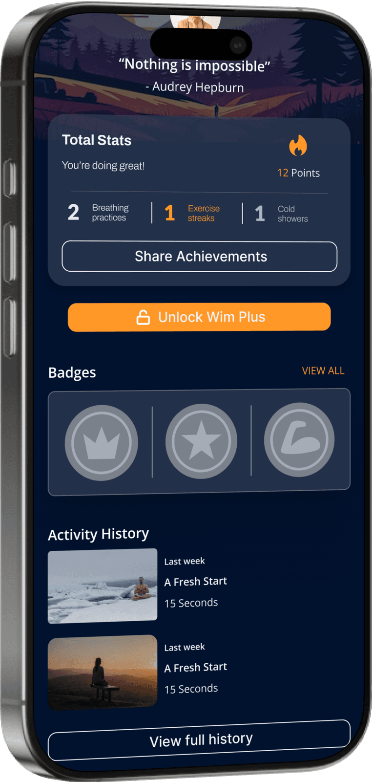
A darker, cold-water palette and a card-based layout that surfaces weekly progress and community numbers.
A home dashboard of weekly stats, a 20-Day Challenge broken down by intensity, and points & badges for completed exercises.
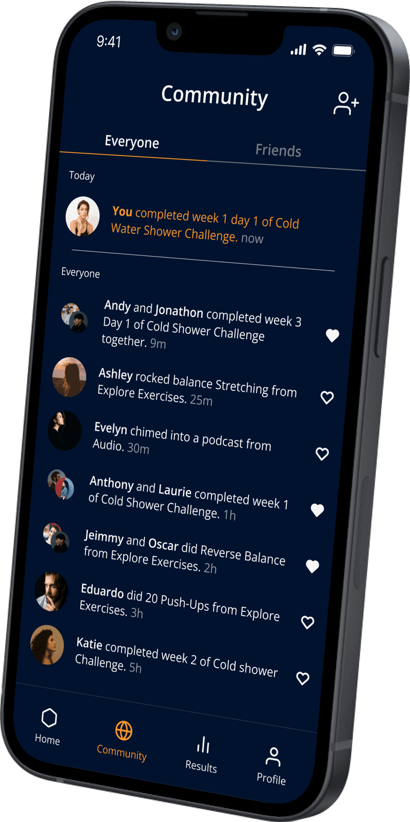
A feed where friends react to each other's accomplishments, so motivation comes from people, not notifications.
Progress on the home screen. Friends in the feed.
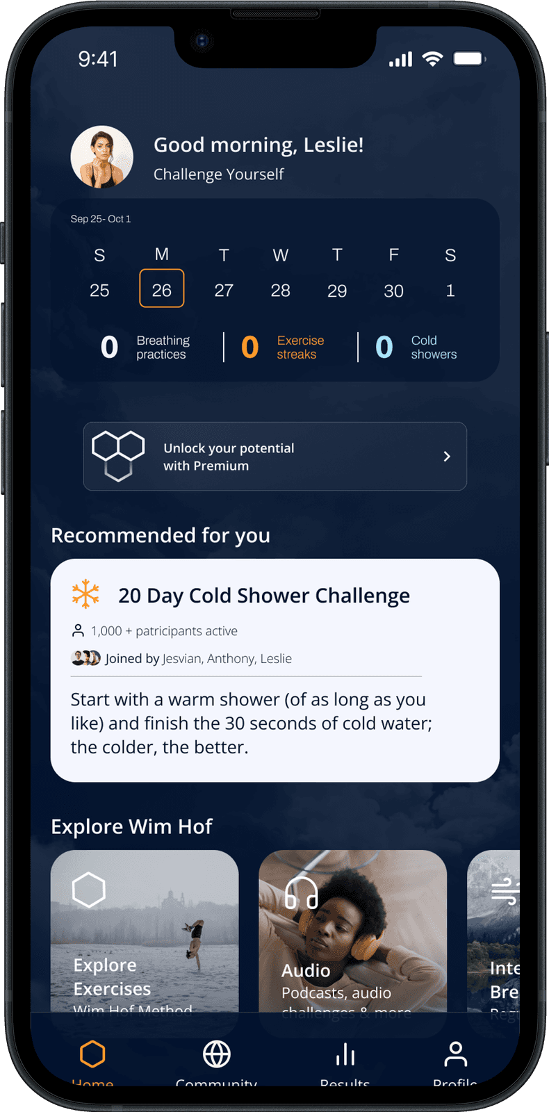
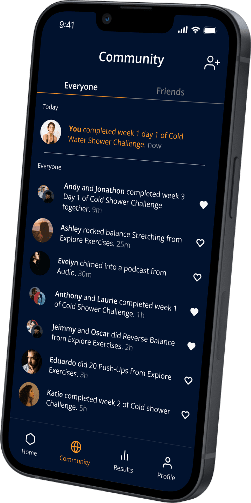
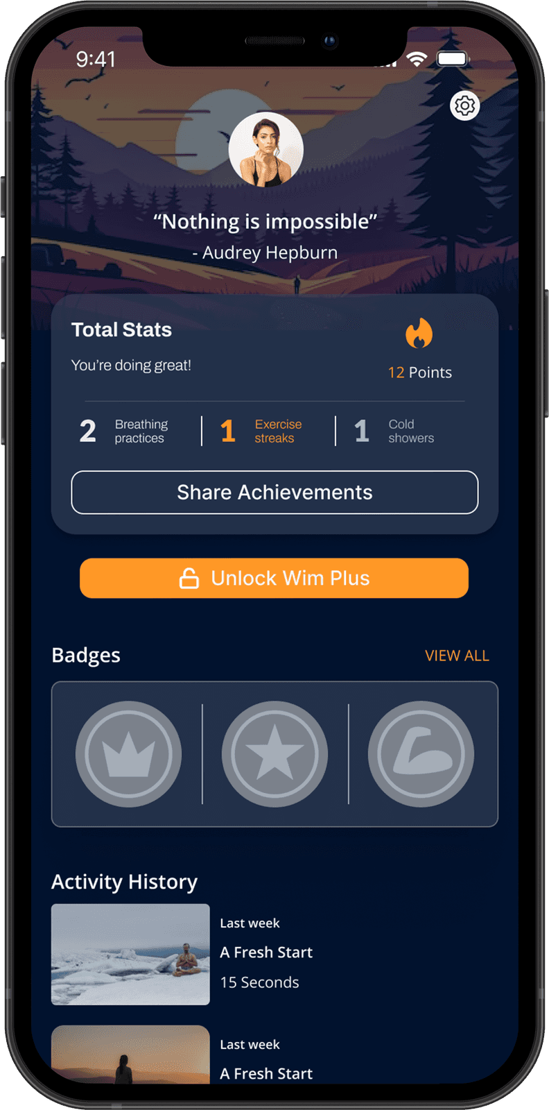
Home answers "how am I doing?" before you ask: your week, your streaks, and one recommended next step. Community turns solo discipline into shared momentum. Profile makes progress something you can hold and share.
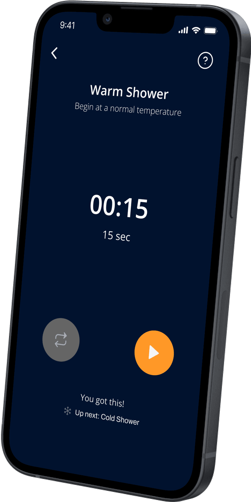
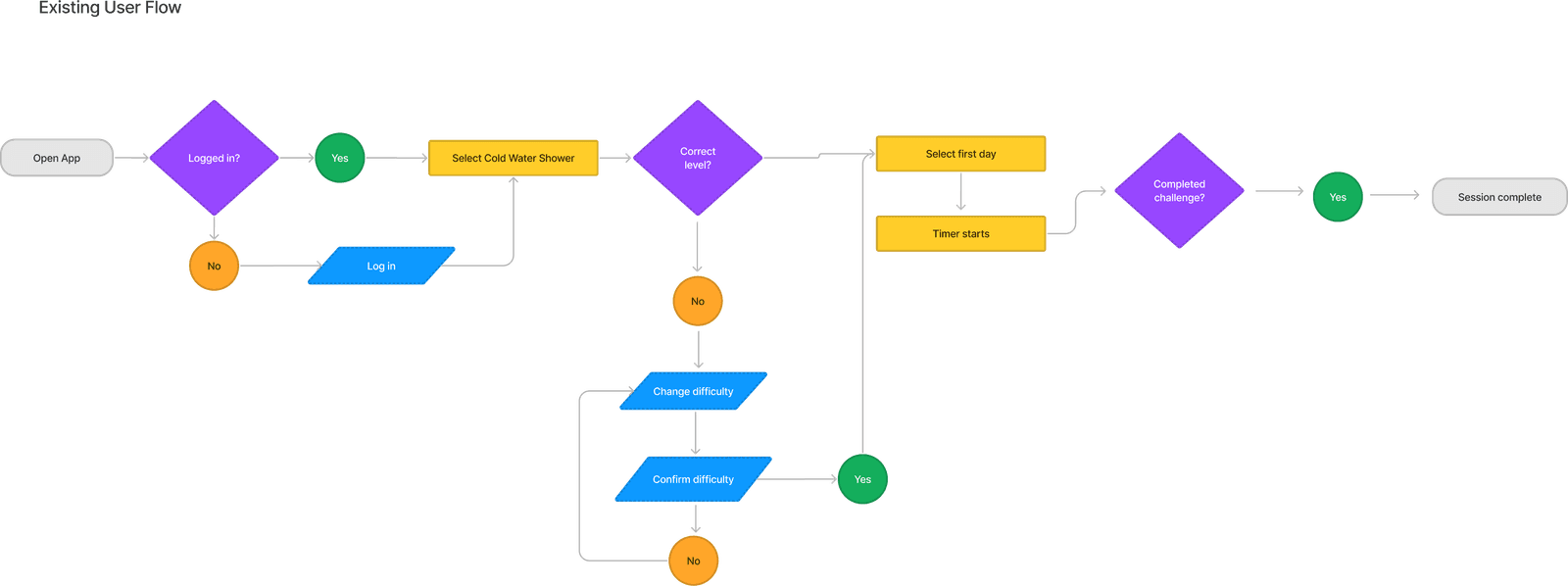
The pop-up timer came straight from testing: users control when the challenge starts, and the app alerts them after the warm-up instead of expecting a tap mid-shower.
What changed in testing.
- A clear first step: one recommended challenge on the home screen instead of a menu of everything.
- Progress you don't have to dig for: the top concern from research became the first thing you see.
- Three test-driven fixes shipped into the final prototype: the post-warm-up alert, visual friend/challenge distinction, and a clarified points vs. badges model.
What I'd do differently.
Prototype in the bathroom, not at the desk. The shower insight came late, from testing. Next time I'd run a contextual test in week one.
Design the week-three moment. Day one is exciting; the real risk is when the novelty wears off. I'd map the drop-off points and design for them.
Breaking the work into tasks and communicating deadlines early kept three people shipping in five weeks. That's a project-management muscle I still use.
Criticism stopped feeling personal once I started asking "which element, exactly?" It's now how I run my own design reviews.