Designing a sales concierge founders would trust, then shipping the version that could.
MyWorker.AI is building a digital teammate that turns a startup's first-time visitors into qualified leads. I led research and UX for its AI concierge: an assistant that had to feel warm without faking being human, and had to survive a hard conversation with engineering.
Six months, one big pivot, and a trust framework that survived it.
We set out to build a lifelike AI avatar. Research told us people didn't want lifelike, they wanted honest. Engineering told us lifelike wasn't shippable yet anyway. The MVP we launched was smaller, clearer, and built on what users actually asked for.
Founders can't personally follow up with everyone. So leads go cold.
Early-stage founders live and die by follow-ups, and every new round of outreach multiplies the follow-up pressure. MyWorker.AI's bet was a digital teammate that greets, qualifies and follows up with a founder's warmth, around the clock.
Why the business cared: the product only works if a curious visitor becomes a qualified lead. If the AI felt cold, pushy or fake, the funnel broke at the very first touch.
The existing lead-finding flow had three leaks:
- Creating a new campaign was redundant, unengaging and long.
- The hook, "Unlock 5 leads for free", was buried in the third product dropdown.
- Lead generation took time, with no wait estimate and nothing else to do in the meantime.
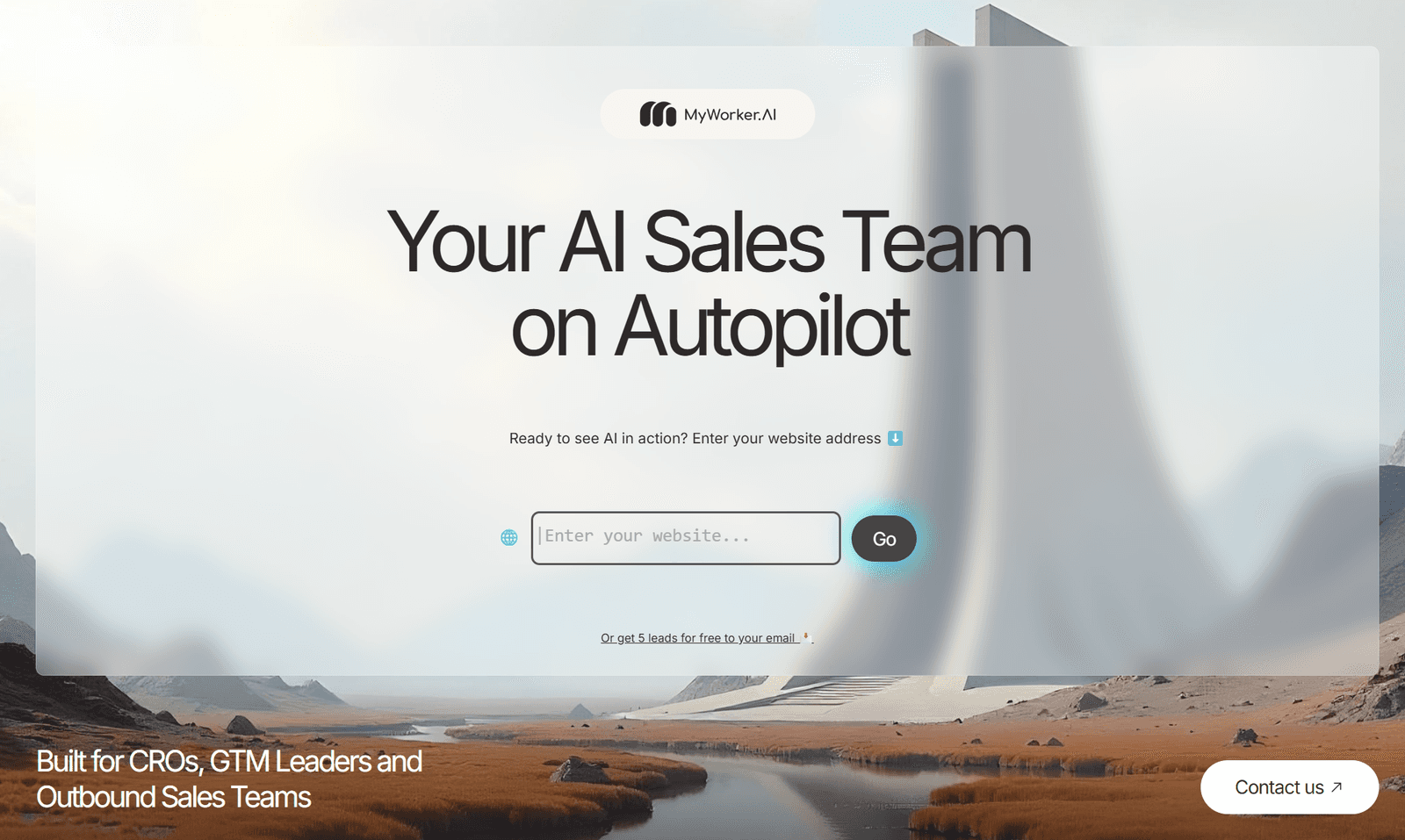
We asked founders what they wanted from AI. They said: honesty.
think-aloud interviews with founders & sales pros
HCI research papers reviewed
competitors analyzed: 11x.ai, Artisan, Tavus
of people advocate for full transparency about AI use
"Warmth up front, speed later."
First impressions are emotional. Efficiency is what earns the second visit.
"These tools fail to build human connection."
Every competitor felt like automation first and relationship second.
"Don't pretend it's a person. Just make it socially intelligent."
The line that reframed the whole project.
We affinity-mapped everything into 7 themes. The core finding: founders wanted AI to handle the mechanics so they could stay authentic, not to replace the personal touch.
- Full disclosure builds trust. Explain how the AI works and when it's working.
- Human-aware, not human-like. Awareness, transparency and timing matter more than a realistic face.
- Trust scales with transparency, not sophistication.
- AI works best as a collaborator, setting the stage for the founder to shine.
The competitive gap: 11x.ai, Artisan and Tavus each solved half the problem. Nobody combined contextual, complex conversation with a lifelike presence built for empathetic sales.
AI should feel like it's setting the stage for the founder to shine, not stealing it.The design principle we took from research
Four things I believed at the start. Tap to see what the research said.
Then engineering said "not yet."
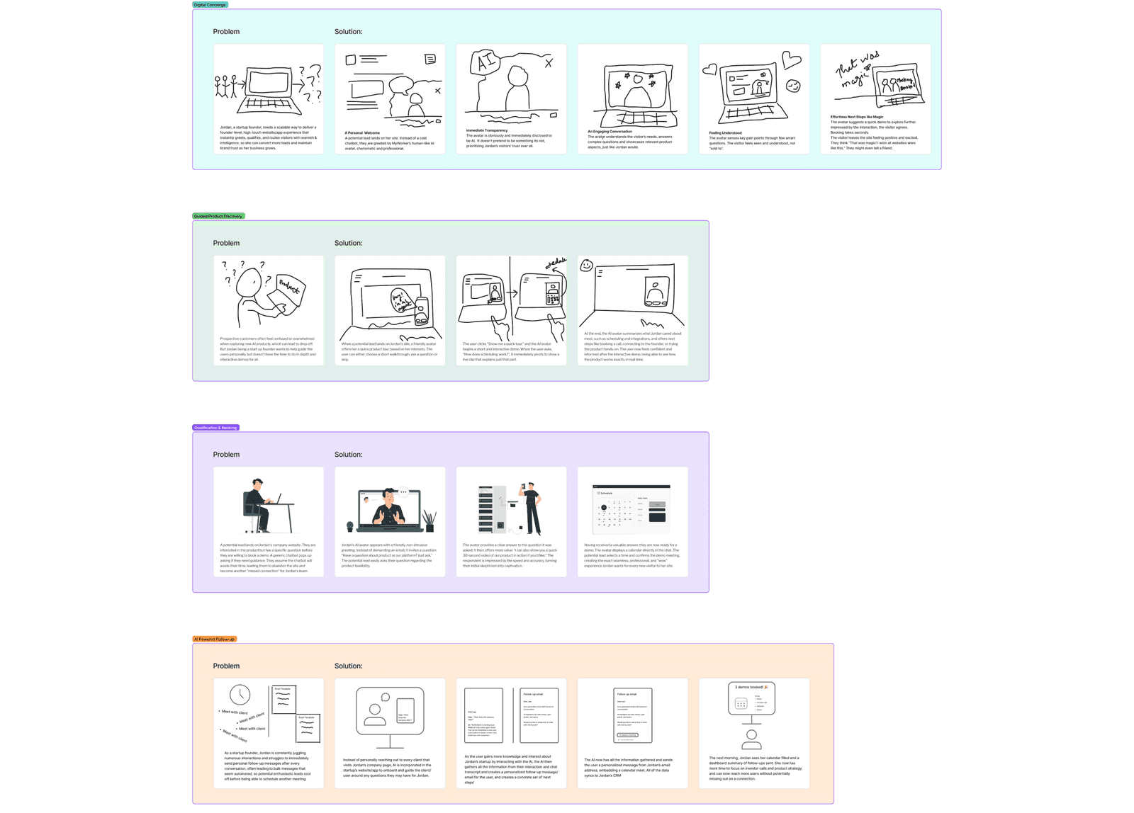
We storyboarded four MVP use cases (a digital concierge, guided product discovery, qualification & booking, and AI follow-up) and organized the design around three themes: immersion, transparency and progressive disclosure.
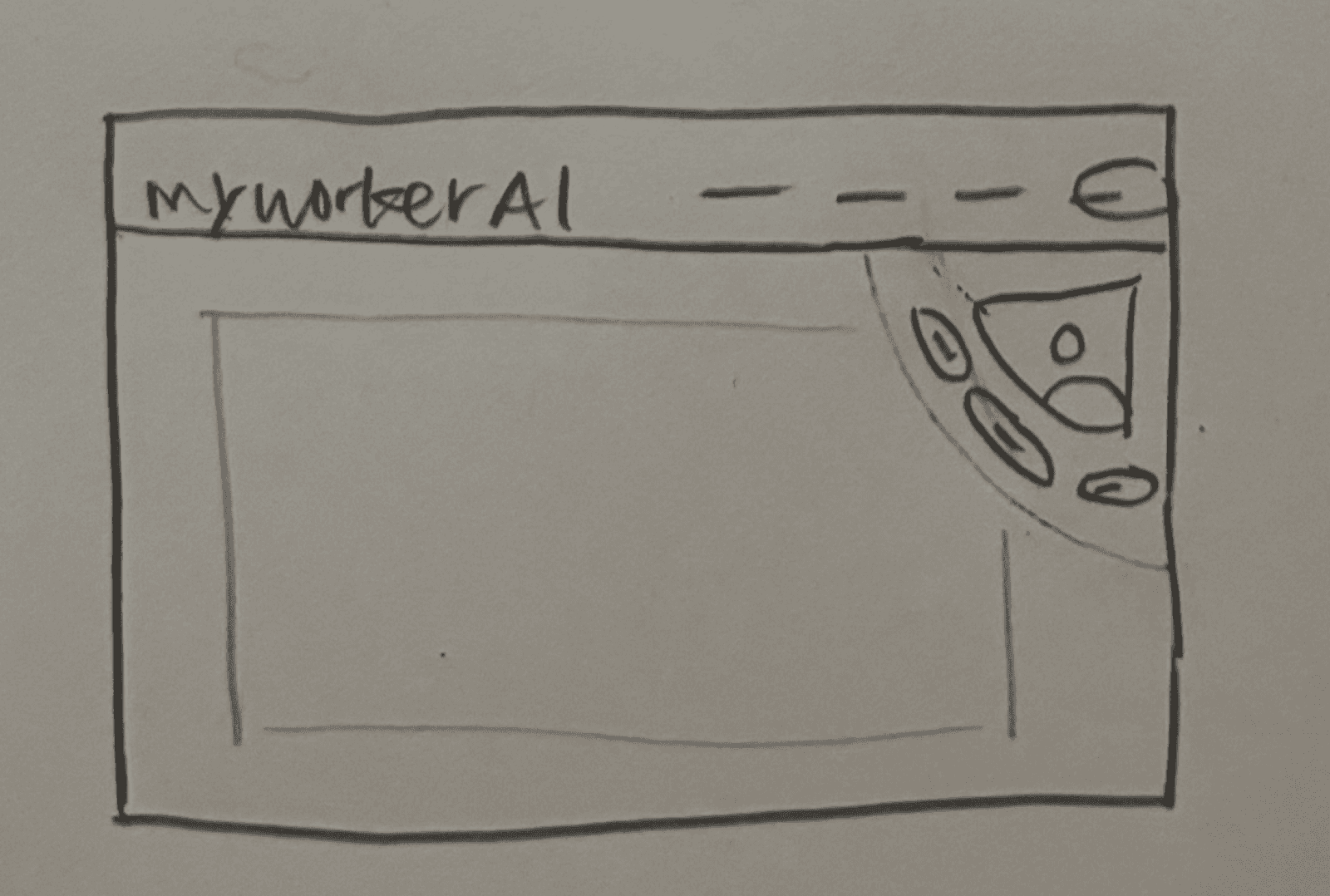
My first pass had three separate flows: the avatar on our landing page, the visitor conversation, and founder onboarding. Mid-fidelity, I condensed them into two MVP states: the avatar on MyWorker.AI's own landing page, and a future state on clients' landing pages.
Then came the meeting that changed the project. Our co-founder and engineer walked us through the pipeline a live avatar needs (text-to-speech, speech-to-text and knowledge-base retrieval, all in real time) and it was either not feasible yet or not cost-effective for an MVP. Having been the engineer in that room before, I didn't fight it. I redesigned around it.
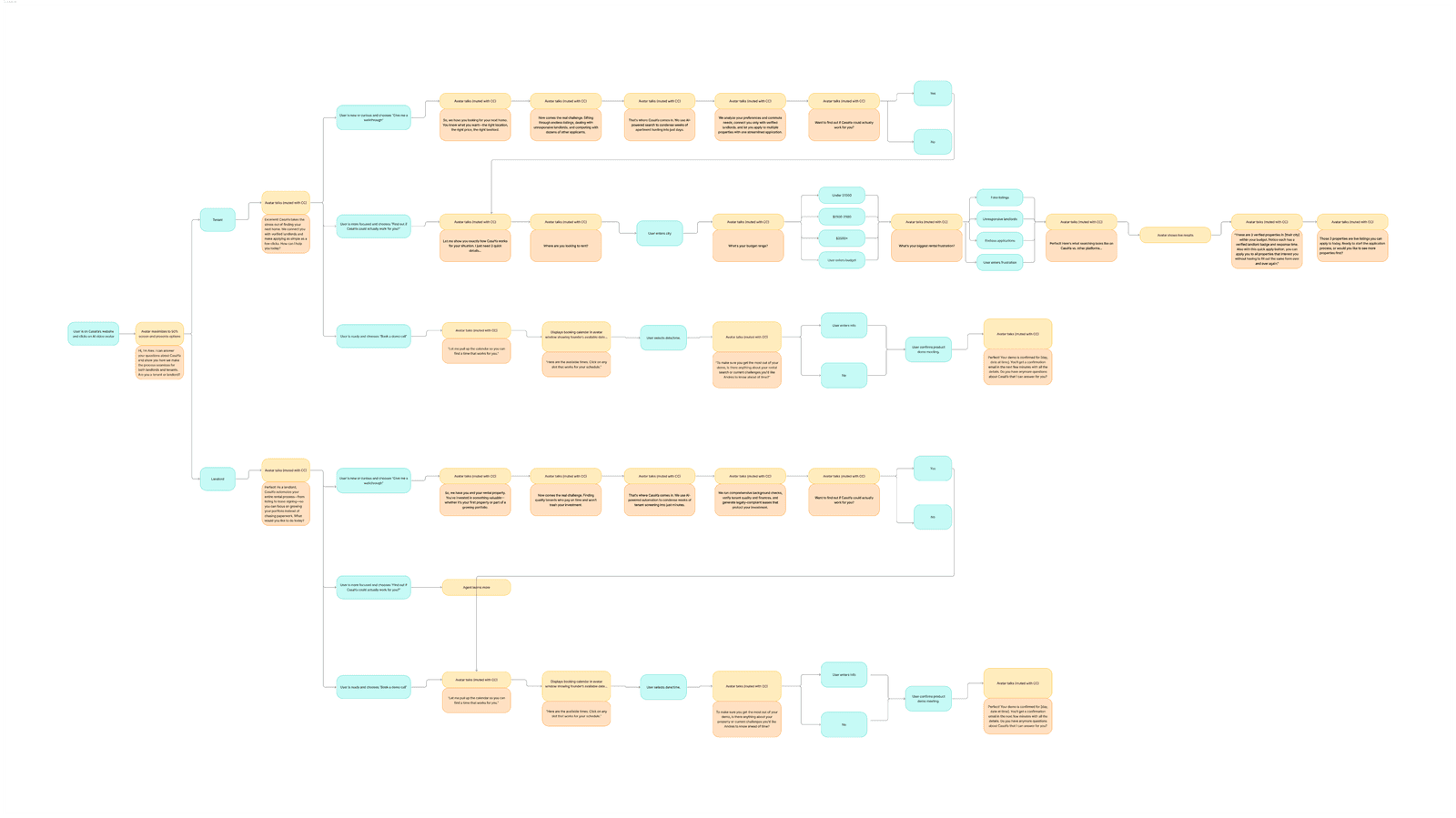
Warm, honest, and short enough to read.
I tested the flow in think-aloud sessions with 6 founders and sales agents generating new leads. Each finding became a design decision:
Text overload. Users skimmed or stalled mid-click.
→ Every AI message condensed to 2–3 lines.
Invisible avatar. People mistook it for a support bot.
→ More prominence, and a clear value line: "Learn about MyWorker.AI".
Trust through demonstration. Email previews made it "real".
→ Sample leads and drafts shown before signup.
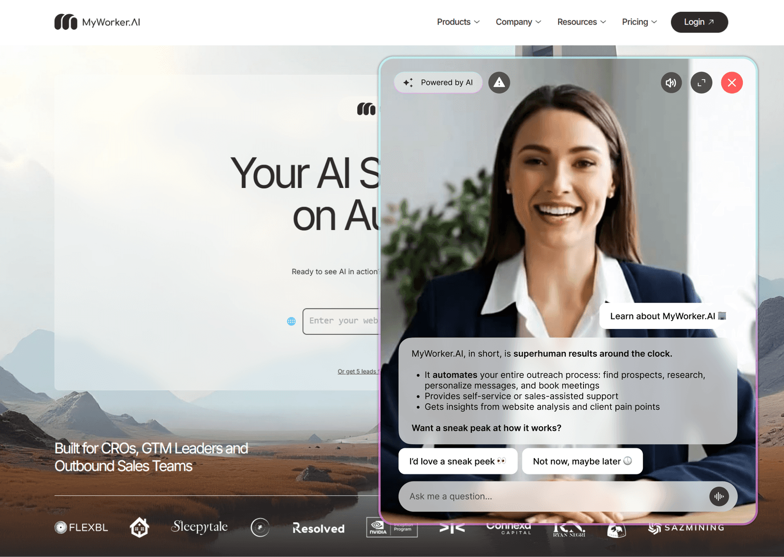
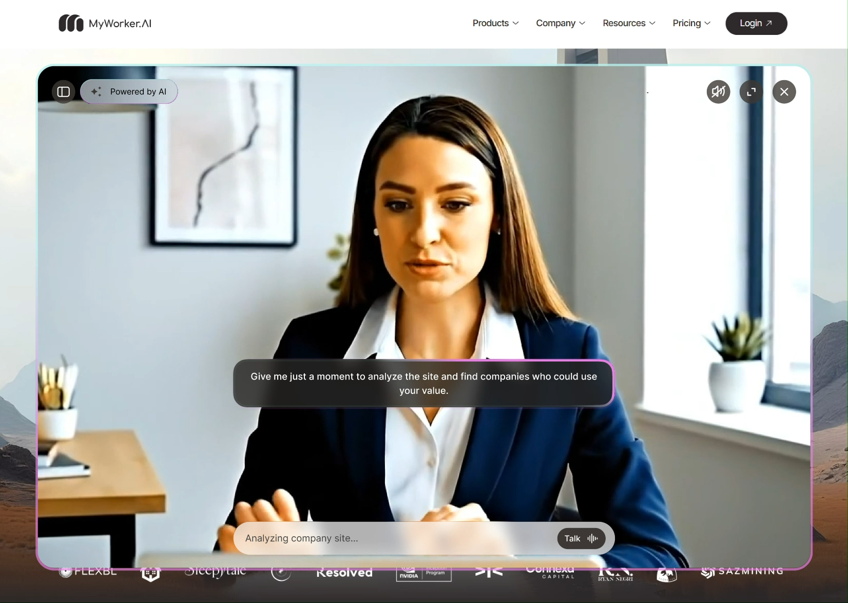
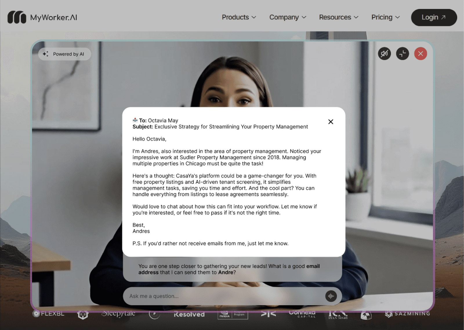
What shipped, and what it changed.
- An MVP that launched: the landing page with a minimized avatar and a text-based guided chat, about 50% of the full vision and 100% buildable.
- A research-backed trust language (immersion, transparency, progressive disclosure) the team could design future states against, including the avatar on clients' own sites.
- A clear bridge between research and engineering: every scoped-out feature had a reason, and every shipped one had evidence.
What I'd do differently.
Bring feasibility into week one. The pivot came after wireframes. A one-day technical spike up front would have focused the concept sooner and saved a design round.
Instrument the MVP from day one. Our strongest signals were qualitative. Next time I'd define the success metric, visitor → qualified lead, before launch.
Ambitious, interactive concepts excited the team, but research showed clarity, simplicity and fast value mattered more. I learned to balance innovation with feasibility.
Iterating means questioning assumed needs against actual needs. I'm better at embracing ambiguity and explaining my design rationale with confidence.